Create Insightful Choropleth Maps by Smart Gradient
January 27, 2024
The creation of choropleth map in TMap visual has been improved by using 3-color smart gradient to map data values recently.
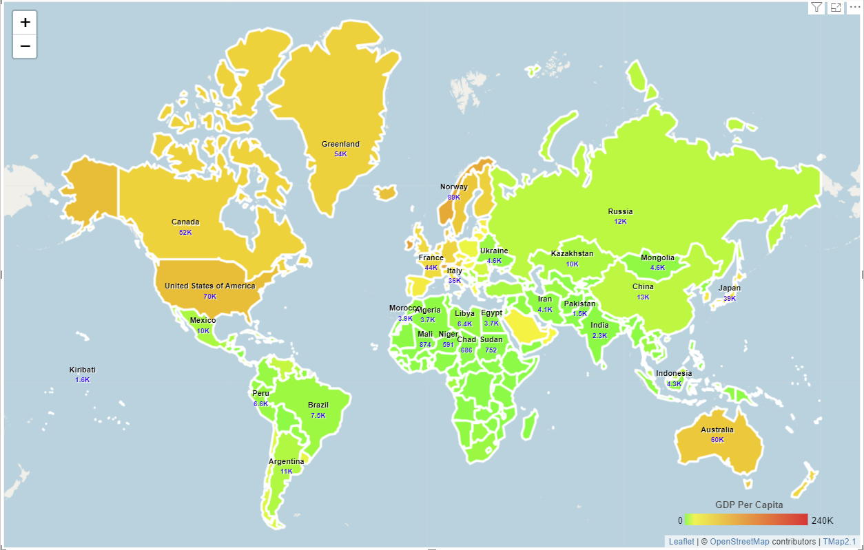
The following example shows that a choropleth map was created by using smart gradient generated by 3 colors (green-yellow-red). From the map, we can easily idenify developed countries (yellow) and developing countries (green).
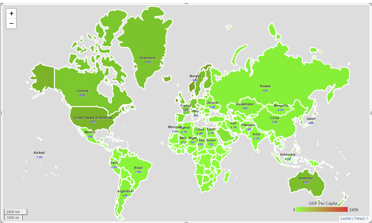
When using non-smart gradient generated by 2 colors (green-red) to create a map, the result is shown as below. It isn't easy to get insights because whole map is green.
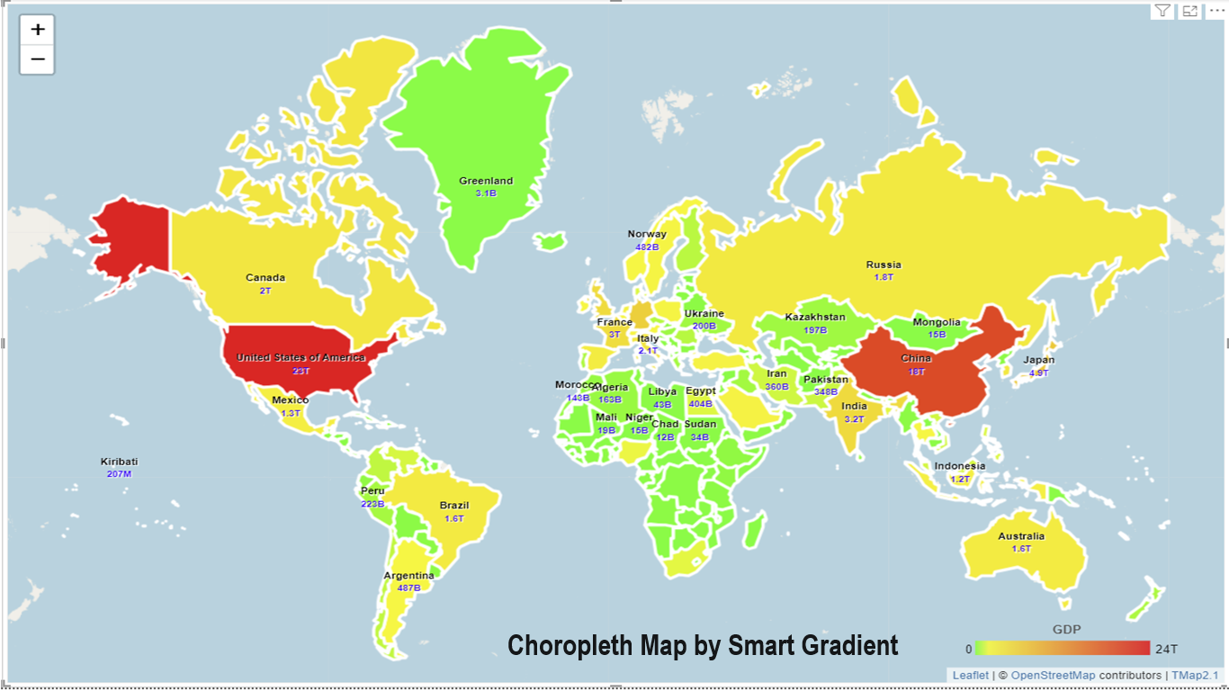
The screenshot below shows that a choropleth map for 2021 world GDP was created by using smart gradient. From the map, we can easily see three worlds based on economic power: super powers (in red color), middle powers (in yellow color) and small powers (in green color).
All above maps were created directly by data-driven gradient. Comparing to the traditional choropleth map, we don't need to classify data manually, and then fill regions with different colors.
You can go to Microsoft AppSource to download TMap Visual and try it.
To learn more on how to use it, please read tutorials
.